STRIDE Checkout Flow
Making checkout easier to follow
STRIDE is a fictional direct-to-consumer footwear brand. This academic project explores a mobile checkout flow designed to make the purchase journey clearer and easier to follow.
The goal was to create a checkout experience that feels clear, reassuring and easy to recover from when something goes wrong.
As the interaction designer, I designed the checkout flow and created the interactive prototype in Figma.
Mobile checkout can become frustrating when users have to complete long forms, are unsure about the next step, or do not understand what is happening during payment.
For this project, I focused on reducing common moments of friction:
- Creating an account before reviewing the purchase.
- Completing too much information on one screen.
- Not knowing how many steps are left.
- Waiting during payment without clear feedback.
- Having to restart after a payment error.
Before designing the screens, I focused on how the checkout could feel clearer and easier to complete on a mobile phone.
- Reducing cognitive load, the checkout was divided into smaller steps so users could focus on one task at a time.
- Keeping users informed, a visible progress indicator and payment processing states help users understand where they are and what is happening.
- Supporting recovery, payment errors allow users to correct a problem without losing the information they have already entered.
Users should not need to create an account before they are ready.
Showing progress can make a longer task feel more manageable.
Clear feedback helps users feel more confident during payment.
A payment error should help users recover, not force them to restart.
Small details such as visible labels, readable text and clear buttons can make the experience easier for more people.
I designed the flow by thinking about the user journey first: what information is needed, what could go wrong, and how the interface could help users continue.
Understand
Identify the main moments that could make a mobile checkout feel confusing or tiring.
Plan
Define the main checkout steps, including payment processing and payment error recovery.
Design
Create a clear mobile flow with guest checkout, visible progress and one main action per screen.
Prototype
Connect the screens in Figma to check the flow, feedback states and error recovery path.
The checkout journey was designed to keep the next step clear, from choosing a product to receiving confirmation. Each screen has one main action, visible progress and clear feedback when needed.
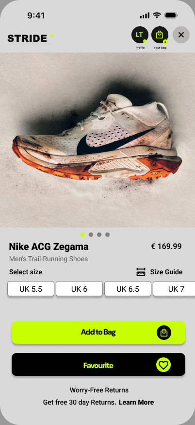
Choose with confidence
Help users select a size and add the product to their bag with clear options.
UX decisionThe size selector is visible before the main action, and the returns message gives extra reassurance before adding to bag.
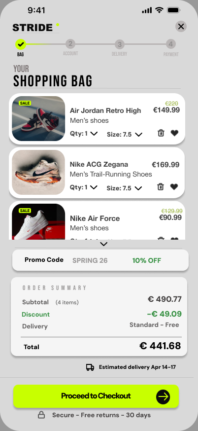
Review the order clearly
Show the items, discount, delivery and total before users continue.
UX decisionThe order summary makes the final cost visible early, while the progress indicator shows what comes next.
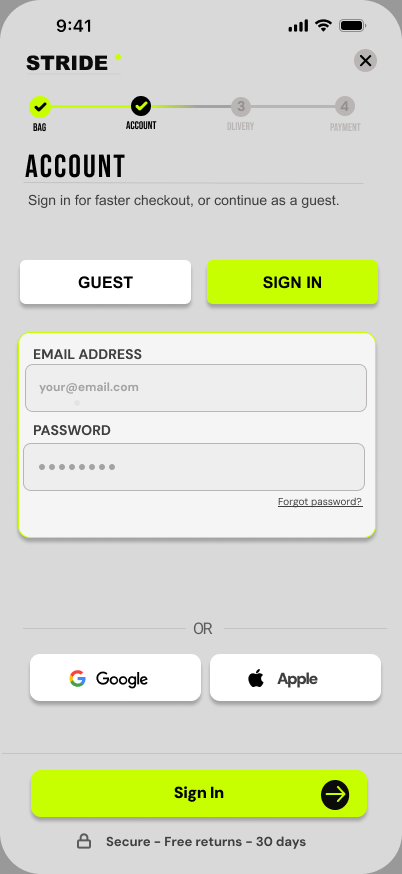
Continue as a guest
Let users move forward without needing to create an account.
UX decisionGuest checkout is presented clearly alongside sign-in options, helping users continue with less friction.
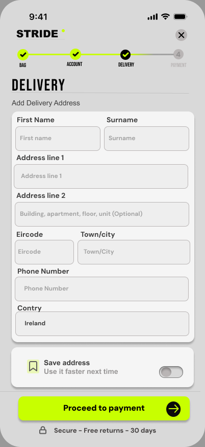
Keep the form focused
Ask only for delivery information at this stage.
UX decisionPersistent labels, optional-field guidance and a clear primary button help make the form easier to complete.
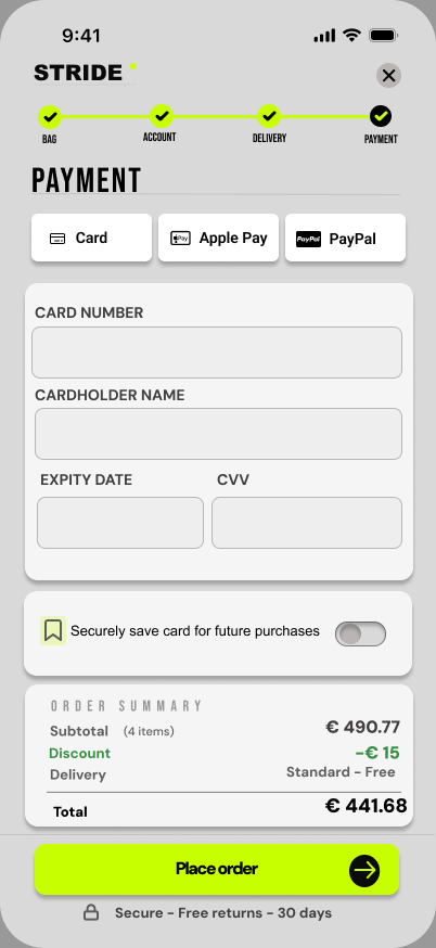
Make payment clear
Keep payment details, order summary and payment options visible in one place.
UX decisionUsers can choose card, Apple Pay or PayPal. The order total remains visible before placing the order.
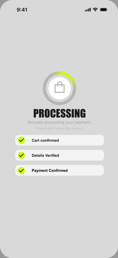
Show what is happening
Give feedback while the payment is being processed.
UX decisionThe processing screen confirms cart, details and payment status, helping users understand that the system is still working.
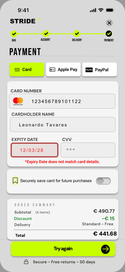
Help users recover
Show the problem clearly without making users restart the checkout.
UX decisionThe incorrect field is highlighted with text and colour, while previously entered information remains visible. The main action changes to “Try again”.
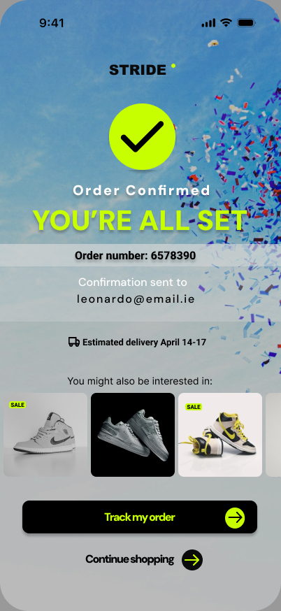
Confirm the order clearly
Let users know the order was successful and what happens next.
UX decisionThe confirmation screen shows the order number, email confirmation and delivery estimate, with “Track my order” as the main next step.
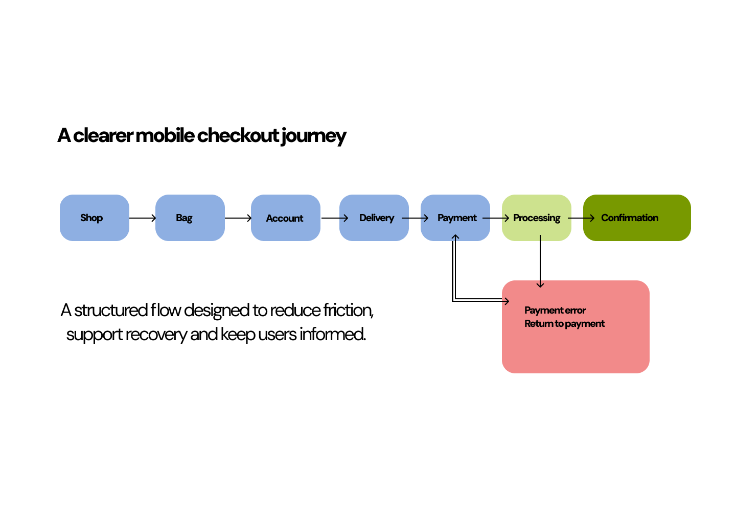
I mapped the main path through checkout, including payment processing, a payment error and the return to the payment screen.
An interactive prototype built in Figma
I connected the screens in Figma to make the checkout journey easier to review as a complete flow.
- The journey from product to confirmation
- Progress and payment feedback states
- Payment error recovery
- Clear next actions at each stage
Preview of the prototype screens.
View prototype in FigmaOne primary action
Each screen has a single, obvious primary action, never competing calls to action.
Thumb-friendly
Primary actions sit pinned at the bottom, sized and placed for one-handed reach.
Visible labels
Fields keep persistent labels, never placeholder-only, so context is never lost on input.
Errors beyond colour
Error states use an icon and explicit text, not colour alone, readable for everyone.
Clear hierarchy
A consistent type scale and generous spacing keep each step calm and scannable.
Visible system status
The progress stepper and processing states keep users oriented at every moment.
A structured mobile flow
The checkout was divided into account, delivery and payment steps so users could focus on one task at a time.
Guest checkout option
Users can continue without creating an account, reducing friction at the moment when they are ready to buy.
Recovery after a payment error
If payment fails, the user returns to the payment screen with their previous information still visible, while only the incorrect field is highlighted.
Good interaction design matters most when something goes wrong.
This project helped me understand that a checkout experience is not only about moving users towards payment. It also needs to support uncertainty, processing states and mistakes in a clear and calm way. Designing the payment error flow helped me think more carefully about feedback, accessibility and recovery.