FramePlan
Turning the scattered logistics of a shoot into one structured workspace.
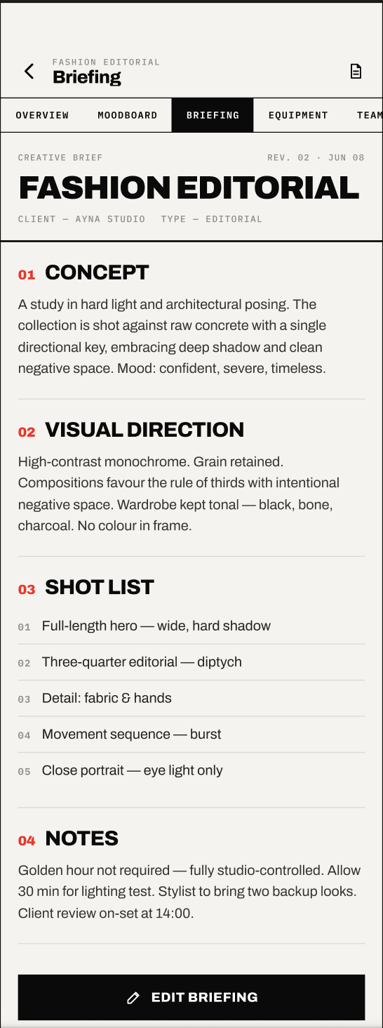
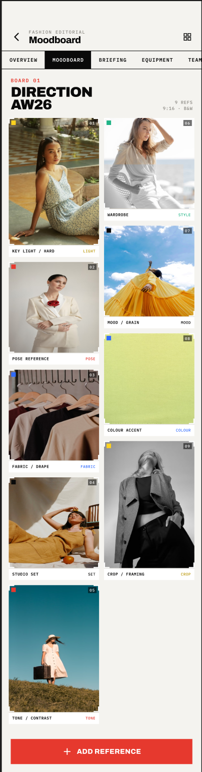
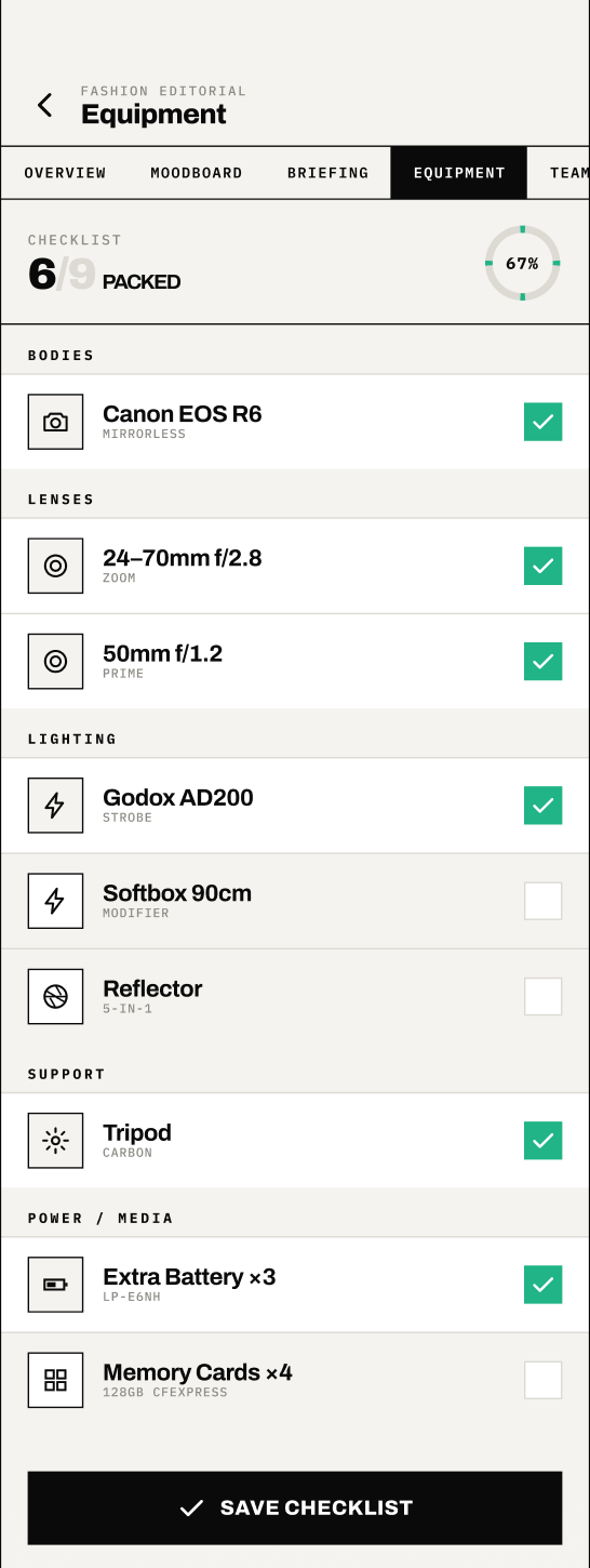
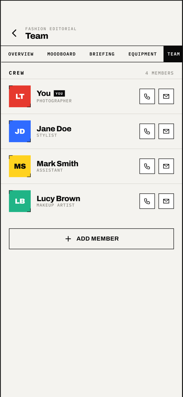
FramePlan is a mobile planning app for freelance photographers. The details of a single shoot — brief, moodboard, equipment, crew — are usually spread across notes apps, group chats and spreadsheets, so something is easy to lose track of.
As my postgraduate capstone at TU Dublin, I designed FramePlan around one idea: every part of a shoot should live in a single, structured workspace, from the first booking through to the day itself.
Sole designer across the full process — research, information architecture, interaction design and the interactive Figma prototype.
Freelance photographers aren't short on tools — they're overloaded by them. The details of one shoot live across several disconnected places at once, so a last-minute change means manually reconciling each of them.
“My shoots live across a notes app, three email threads and a spreadsheet. Something always falls through the cracks.”
I combined stakeholder interviews with a competitive analysis of existing planning tools to locate where the workflow actually broke down.
- Interviews with working photographers surfaced a shared frustration: keeping every detail of a shoot in one trustworthy place.
- A competitive analysis of calendar, project-management and notes apps showed none were structured around the stages of a shoot.
- Pain points clustered into three areas: planning the shoot, briefing the client, and prepping the gear.
The problem is fragmentation, not a missing feature.
Photographers think in shoots, not tasks.
A tool only helps if it's reliably the single source of truth.
Briefing a client is a distinct job from planning logistics.
Gear prep needs a checklist, not a paragraph.
I worked through the Double Diamond in deliberate loops — diverging on the problem, converging on a focused mobile concept, then prototyping the riskiest flows first.
Discover
Interviews and competitive analysis to frame the real problem.
Define
Synthesis into three jobs-to-be-done and a single problem statement.
Develop
Information architecture, user flows and the core screen structure.
Deliver
An interactive Figma prototype covering the full planning journey.
FramePlan wasn't designed as a set of isolated screens. Every shoot is one project object with five attached sections — brief, schedule, team, equipment and shot list — that can be completed in any order and stay in sync wherever they're viewed.
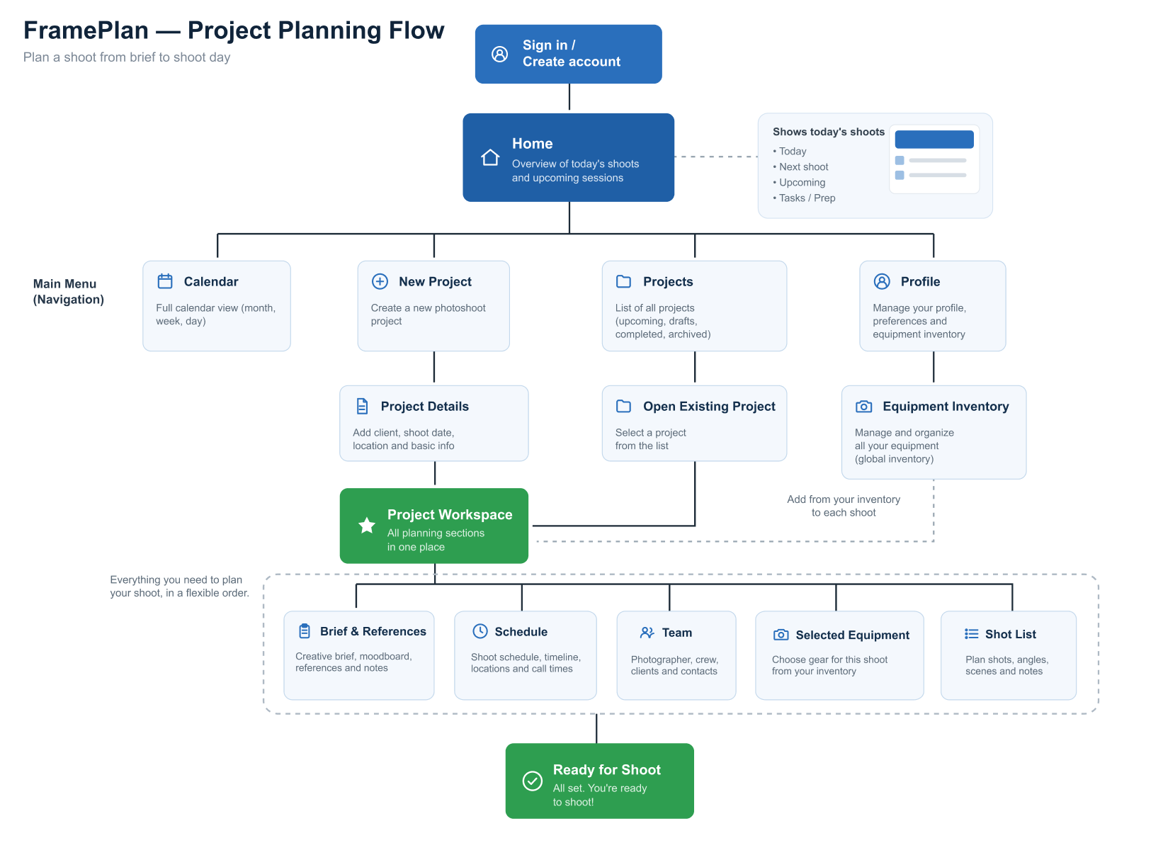
The journey follows a shoot from sign-in to shoot day — sign in, land on today's agenda, start a new project, then work through its brief, moodboard, equipment and team in one workspace.
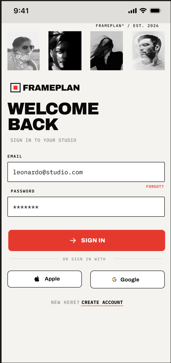
Get in without friction
Let a returning photographer sign back into their studio quickly.
UX decisionApple and Google sign-in sit alongside email, since photographers are often mid-shoot and reaching for the fastest path in.
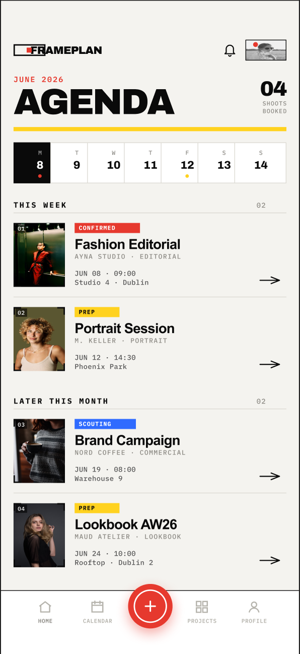
Open on what's next
Show today's and this week's shoots immediately, not a dashboard.
UX decisionShoots are grouped by "This Week" and "Later this Month" with status tags (Confirmed, Prep, Scouting) so priority is visible at a glance.
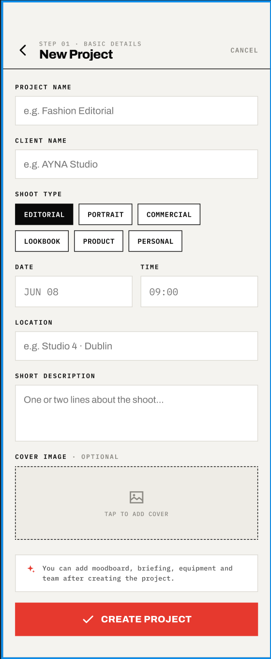
Capture the essentials first
Get a shoot's core details down in one short form.
UX decisionShoot type is a one-tap chip group, and a note clarifies that moodboard, briefing, equipment and team can all be added afterwards — lowering the barrier to just getting started.
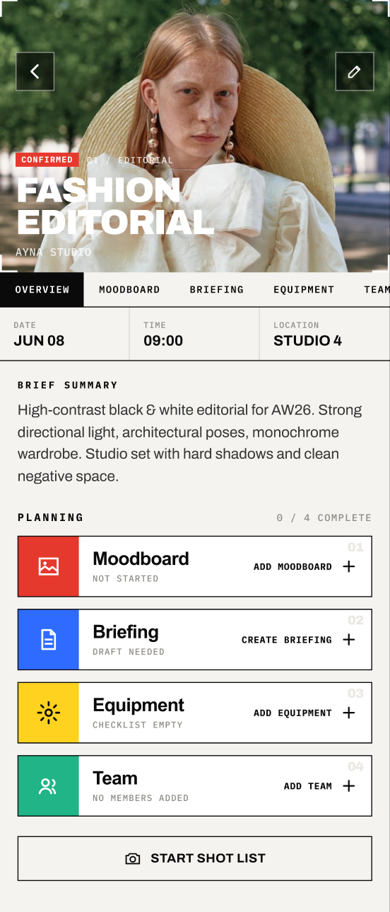
One workspace per shoot
Give each shoot a home that surfaces what's still incomplete.
UX decisionA planning checklist (Moodboard, Briefing, Equipment, Team) shows completion at a glance, so nothing gets forgotten before shoot day.
A brief worth sharing
Turn loose creative notes into a structured, shareable brief.
UX decisionAn "AI-assisted structure" action helps draft concept, direction and shot list from rough notes, while the photographer stays in control of the final wording.
Direction, at a glance
Collect visual references and tag what each one is doing.
UX decisionEach reference carries a short tag — Light, Pose, Fabric, Mood — so the board reads as a direction, not just a pile of images.
Pack with confidence
Turn a gear list into a checklist that can be verified before leaving.
UX decisionGear is grouped by category (Bodies, Lenses, Lighting, Support) with a completion ring, so a partially packed bag is visible before it becomes a problem on-site.
Everyone, one tap away
Keep the crew's contact details attached to the shoot itself.
UX decisionCall and message actions sit directly on each crew member's row, so coordinating on the day doesn't mean leaving the app to find a number.
An interactive prototype built in Figma
I connected the screens in Figma to walk through planning a full shoot end-to-end, from the agenda to a packed kit bag.
- The journey from sign-in to a ready-for-shoot state
- Brief, moodboard and equipment as linked sections
- Completion states across the workspace
- Crew contact actions in context
Preview of the prototype screens.
Open on the next shoot, not a dashboard
The home screen prioritises immediate action over passive metrics — photographers open the app mid-shoot, reaching for what's next.
One project, five linked sections
Brief, moodboard, equipment, team and schedule live under a single project so an edit in one place is never contradicted elsewhere.
Checklists over prose
Equipment and planning progress are shown as completion states, not paragraphs — a format that can be checked in seconds before leaving for a shoot.
Clear completion states
Checklists use both a check icon and a label, never colour alone, to show what's done.
Thumb-friendly
Primary actions sit within easy reach for one-handed use on set.
Visible labels
Form fields keep persistent labels above the input, not placeholder-only text.
A focused, well-researched concept beats a broad feature list.
Designing the single source of truth first made the rest of the product fall into place. Keeping brief, moodboard, equipment and team under one project, instead of as separate tools, was the decision that mattered most — and the one I'd protect first in any future iteration.